SUMMARY
Target Audience
People who are new or returning to fitness, want to find activities they like, and get into a good routine will be interested in FitFrog.OBJECTIVE
Motivate people into an exercise routine that suits their level, schedule, and interests even if that means fitting in as little as 5-minute routine.Defining the problem
Finding exercise routines for your level can be difficult, especially if you want to try something new. Exercising alone can be insufficient and time constraints can make it even harder.
Solution
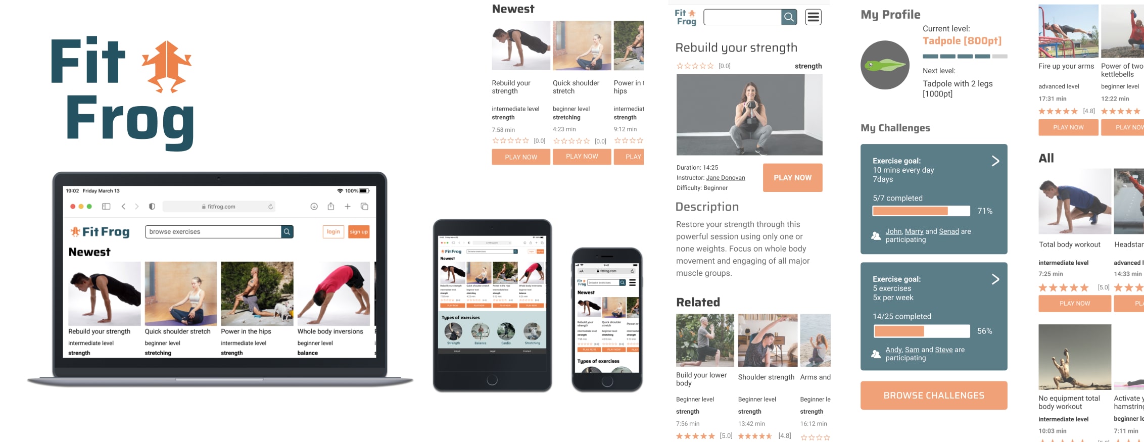
This responsive web app helps to find routines that fit into the schedule. The web app is designed to encourage people who want to get into an easy routine for physical activities. This means fitting in as little as a 5-minute. With the option to participate in group challenges and share results, exercising can be more fun and motivating.
Role
I served as the end-to-end designer for this student project. My responsibilities included conducting research, defining personas, creating wireframes, and delivering a final user interface.
WHO ARE OUR USERS?
Our users are respresented by Kate.
Kate:
- Wants to lose weight and get in shape as her sedentary job doesn’t allow a lot of time for exercising
- She wants short exercises that she can do multiple times per day in between other activities
- She wants the tool to keep her motivated as well, as her schedule can often be distracting
- Rebecca is very tech savvy, as she works on computers every day
- “I love the thought of having something that could really work with my schedule. Being as busy as I am makes it tough to exercise otherwise.”
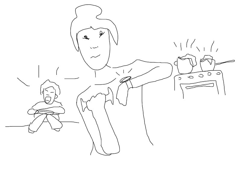
Kate
(developer; lives with her boyfriend and 3 year old daughter)
- Wants short exercises she can do multiple times per day in between other activities
- Wants a tool to keep her motivated
- Wants a routine she can enjoy
PREPARING THE STRUCTURE
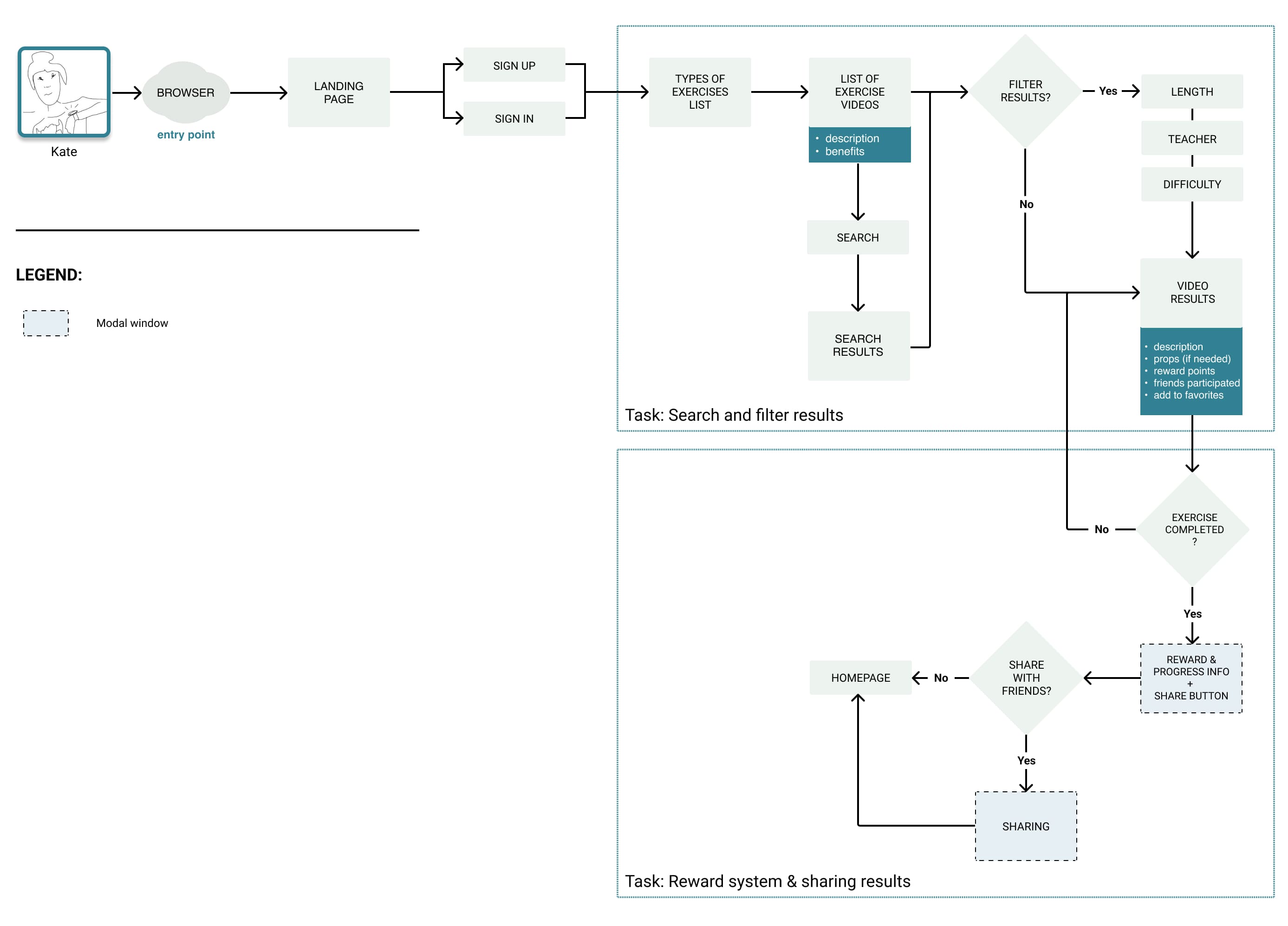
Based on the feature and user requirements, I created general user flow to visualize the process and to see what pages do we need. It is focused on two main tasks - to search and filter results and results sharing.
SKETCHES AND WIREFRAMES
Based on my research findings and user flow, I brainstormed several ideas for the main screen layouts by keeping in mind that my users value fast aproach because of their time constrains. With that in mind, I created a low-fidelity prototype and tested it via remote usability testing with four people and with a peer-review method. Participants had two tasks to perform:
- Search and filter search results
- Share the successfully finished exercise
The following usability issues were uncovered:
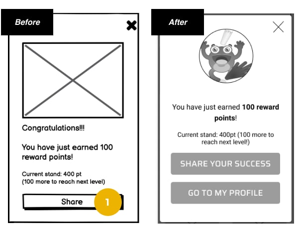
1. Sharing results screen had limited sharing options
Reluctant to share results (Some participants felt reserved when it came to sharing the results screen.) To accommodate this, the second option was added on the sharing screen, which takes the user to his profile.
This issue was recurring so after going deeper into this, I found out via survey that people prefer to share their fitness results either in private conversations or in personal messages.
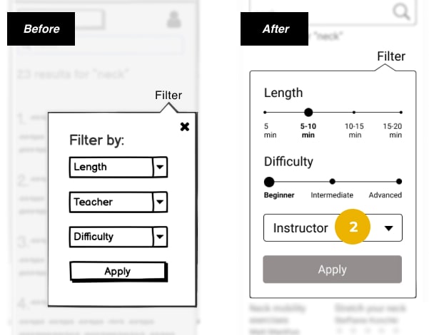
2. The option to filter results was deficient
Users spent more time than expected on the task of filtering the search results. It needs to be clear and available right away. Filters are there to make the task of finding the suitable exercise faster. The modal for filtering search results was too small, and the number of clicks could be minimized.
USABILITY TESTING
The possibility to filter results has to be very functional and must take little time to be completed because our users are short on time. That’s the reason why the next round of usability testing was focused on filters.
Most important remarks
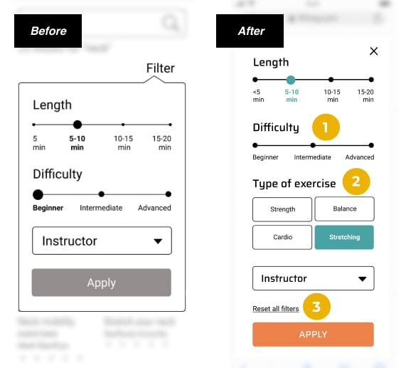
1. What do I do when I want to see results for all levels of difficulty?
The default difficulty level is unselected and this means it gives results for all levels of difficulty. The same goes for the Length as well (image here represents only some options selected).
2. Filter: Problem: “What if I want to search for a specific type of exercise?”
Type of exercise option was added to simplify the process of choosing the right exercise.
3. Faster filtering options
Option to quickly reset all filters to their default state.
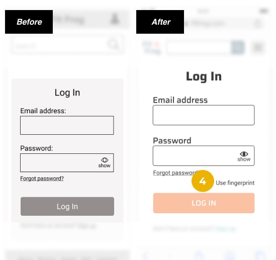
4. Login screen: “I don’t like to type. I like when I can sign in faster, with my fingerprint for example.”
Our persona (our user) is tech-savvy, so adding the ability to use a fingerprint to the login screen was a reasonable option.
ITERATIONS
With those changes, the mid-fidelity prototype was created and went under extra refinement including:
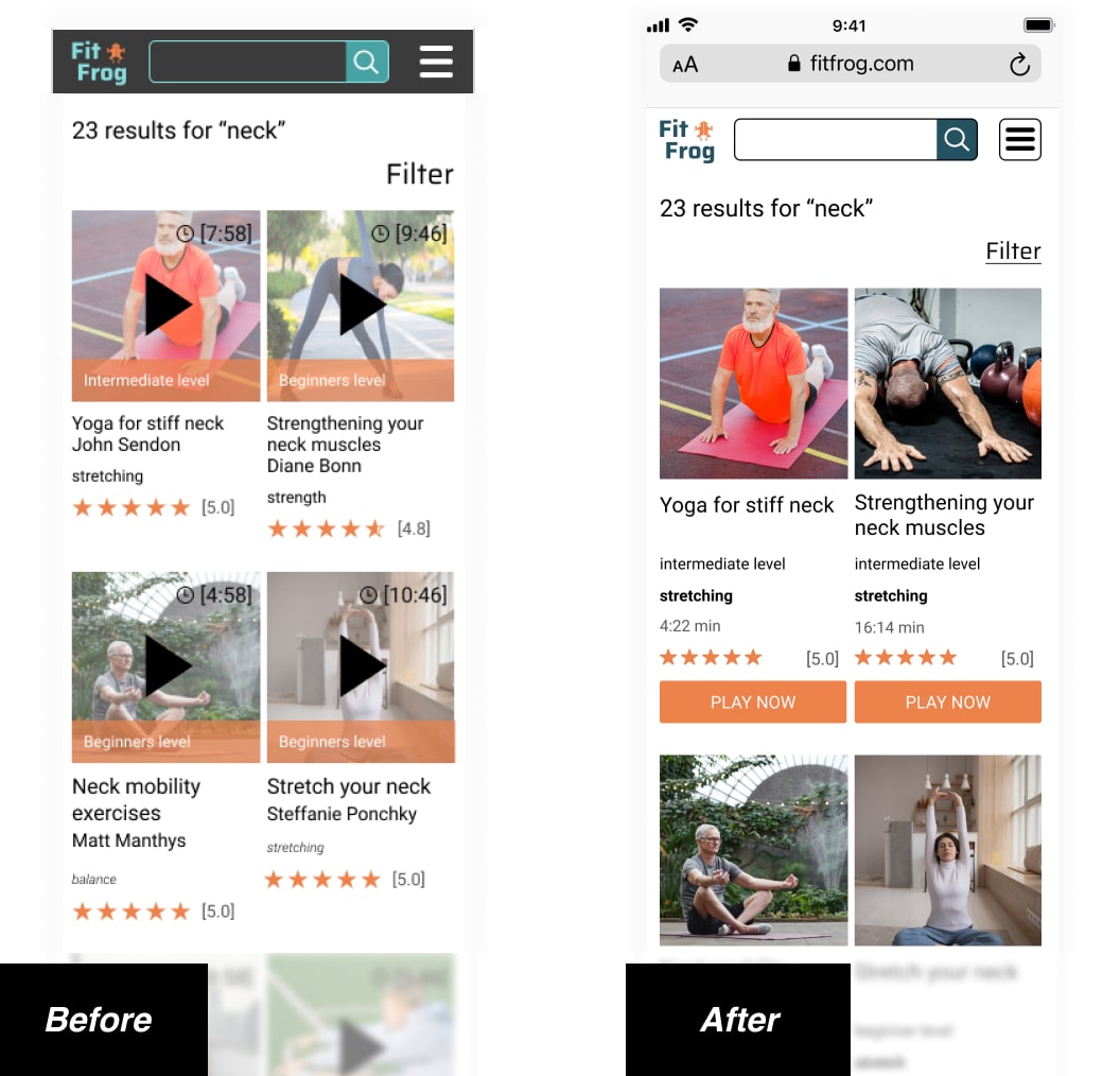
- The peer-review session resulted in a clearer video presentation (the “Play now” button was removed from the video preview and added underneath so nothing was obstructing video images - thumbnails).
- The dark navigation bar changed from a darker to lighter appearance to be more in line with the color palette and the overall design mood that represents activity, movement, and focus.
NEXT STEPS
- Test the messaging system between users
- Develop, refine and test group and individual challenges
- Incorporate an option to schedule an exercise and add it to the calendar
CONCLUSION
Overall, I think my designs were successful in creating a simple interface that allows users to easily search for and filter exercises to find the most suitable one that fits their time constraints.
Given the few usability issues identified in the prototype, however, I would like to validate the iterations I made by conducting another round of usability testing and make improvements toward a stronger solution.
