SUMMARY
Target Audience
I began this project by learning more about Expany's target market. Based on my research I determined that Expany's target audience mainly consists of Millennials (younger people are less likely to elicit expert help and older people may be more likely to be turned off by the technology and video chat aspect). These people (aged 22-40) are the most common group of expats in Germany.Defining the problem
Expats in Germany have a hard time managing their life - because everything is in German, a language many haven't mastered yet. There is no online and reliable help provided in the English language that is fast and up-to-date.
Solution
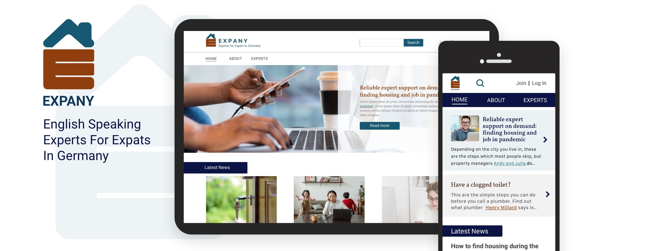
To overcome this crucial problem, the aim is to create a responsive web app that will allow users to contact English speaking experts via video calls.
Role
I served as the end-to-end designer for this student project. My responsibilities included conducting research, defining personas, creating wireframes, and delivering a final user interface.
Market and Target Audience Research
Expat Insider report for Germany (2019) shares challenges of settling in and it confirmed the problem statement.
"Expats in Germany struggle with the local language the most — the country ranks 56th (out of 59) in the Languages subcategory.”
"More than 50 percent say that it is impossible to live well in Germany if you do not speak the language.”
"Germany lands in the bottom 5 in the Ease of Settling In Index.”
In the absence of direct competitors, I looked for and analyzed websites and services that provided either information about expat's life in Germany or video chat help (“Make It In Germany”, “InterNation”, “IAmExpat”, “6ya”, “Clarity” and “The German Way”). This helped me to identify common patterns, solutions, and potential improvements..
Then, I joined 4 Facebook groups for expats in Germany and I analyzed their questions.
I found out that:
- Their primary source of information is not websites I discovered earlier, but a word of mouth, forums, and Facebook groups
- There are two most common types of people asking questions - those who plan to move to Germany and those who already live there
- All questions can be grouped in 10 main categories
WHO ARE OUR USERS?
In the next step, I conducted user interviews with six people.
Key findings:
- Additional information is found also on YouTube and personal blogs
- Existing ways of getting help are lengthy and frustrating
- Oftentimes users don't know whether they have the right document(s)
- They spend a lot of time and money because they don't speak German and sometimes don't understand how things work
- They feel abandoned and alone when faced with obstacles
- The information they get is sometimes outdated, partially correct, or not applicable to them
With the information, I gathered from research and user interviews, I created two personas: Yasin who will represent those who already live in Germany, and Bianca who will represent those who plan to move to Germany. Their motivations, needs, and frustrations influenced every major decision in the product development process.
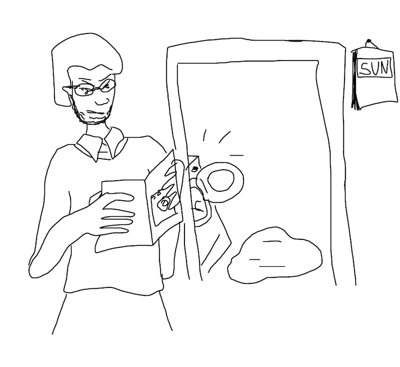
Yasin
(already lives in Germany)
- Needs to get to the expert as quickly as possible
- Has already clearly defined problem
- Specific questions
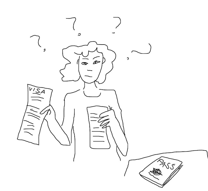
Bianca
(plans to move to Germany)
- Has many general questions
- Not so urgent
- Needs clear and very detailed guidance
- Needs someone to point her in the right direction
- Complex situations and questions
PREPARING THE STRUCTURE
With all collected user data, I was able to prioritize the website's features and content. I then identified the intersection of business and user goals.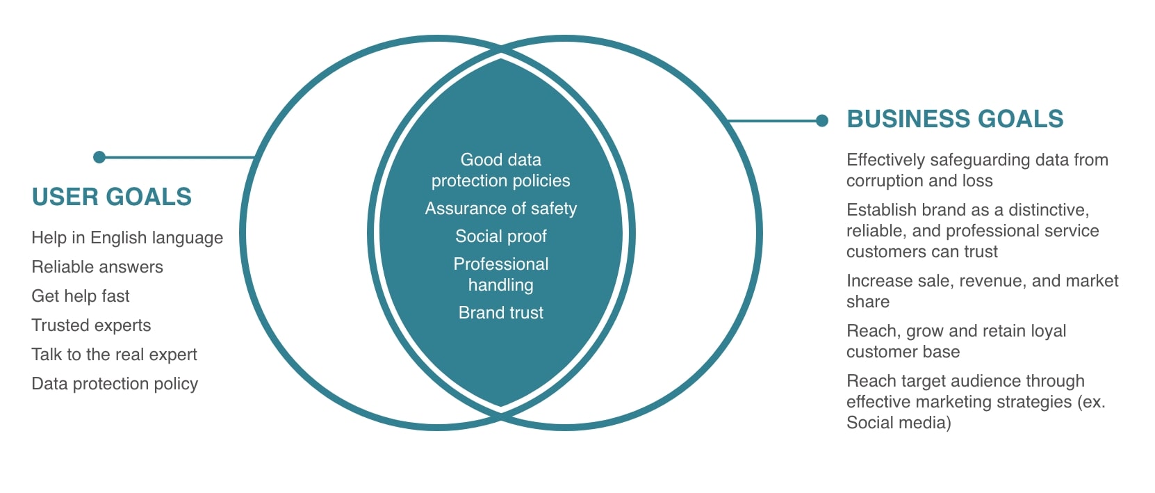
The main project goals I identified were as follows:
- Securing brand trust for Expany
- Providing assurances of product value
- Professional handling
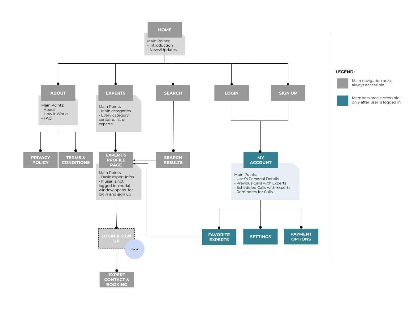
Sitemap
For users to effectively use this web app it is a necessity that navigational items are easily understandable and accessible. To achieve that, I performed an online open card sort with eight participants and with one in person. Using my feature roadmap and card sorting results, I created a sitemap to gain a full picture of the website.
HOW USERS THINK & WHAT THEY DO
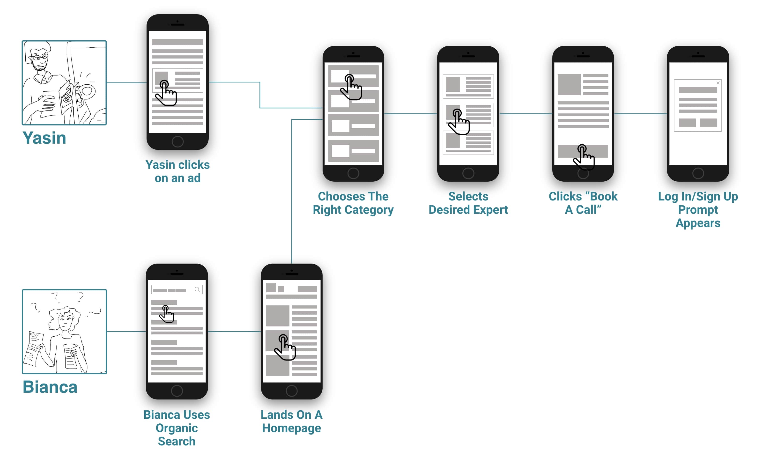
To uncovered the number of screens we will need, I created the three most important user flows: browsing the experts, sign up/login, and booking a call. The flows mapped each step from the entry point to the final interaction to understand the user's entire journey throughout the interface. This enabled me to more deeply empathize with the various interactions and decisions the user would be faced with and to continually iterate the flow toward a more frictionless interface.
SKETCHES
Based on my research findings and information architecture, I brainstormed several ideas for the main screen layouts through low-fidelity sketches by keeping in mind that my users value clean and direct access to the information and easy browsing.WIREFRAMES
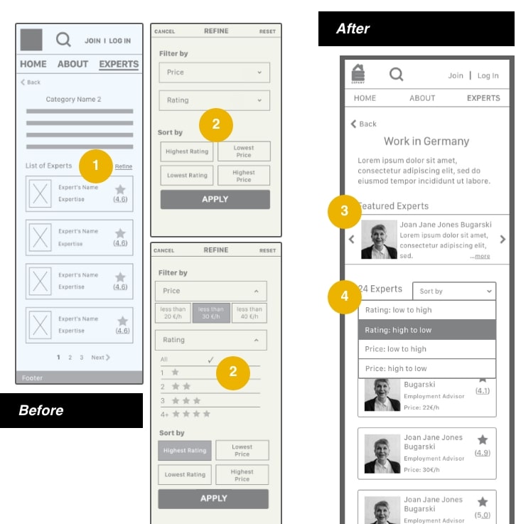
Once I had decided on a layout direction, I used my sketches to create a mid-fidelity prototype. It consisted of the homepage, categories pages, user's and expert's pages, and the booking process pages. For this, I used Balsamiq and Adobe XD. With the feedback received from my tutor and peers during critique sessions I improved it:1. “Refine” was replaced by “Sort by” because its function is clearer. Sorting results are no more modal, it's a dropdown list, saving time and extra clicks.
2. Results were filtered and sorted. Now they are only sorted to simplify the functionality and the interface (everyone would choose the highest rating and lowest price).
3. “Featured Experts” are added to highlight the most relevant, popular and best rated experts in a given category.
4. The title “List of Experts” is replaced by the number of available experts. That data is more useful and informative.
USABILITY TESTING
After the round of peers' and mentor feedback, I enhanced the mid-fidelity prototype. To reveal possible usability problems, I conducted moderated remote usability tests with 6 participants from the target audience.
They were asked to complete three tasks:
- Create an account and log in
- Find an eligible expert
- Finish the booking process
The following usability issues were uncovered during tests:
Key Issues
The calendar for date selection was not easy to use
Most participants had issues with booking because the current calendar was not clear enough.
The booking process was unclear
Some users were confused with the booking process because the interface was overwhelming and overly busy. Seeing the process bar at the top was not helping enough to provide clarity of the booking journey.
ITERATIONS
Based on the feedback received, the following changes were implemented:
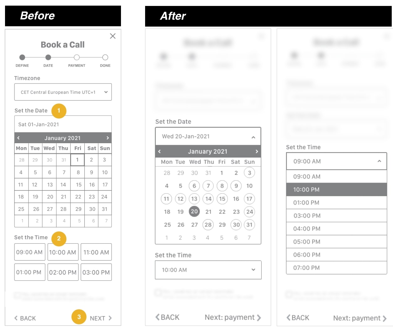
1. Outlines from the calendar in the booking process were removed and available dates were circled and colored darker to emphasize the distinction between them and unavailable days.
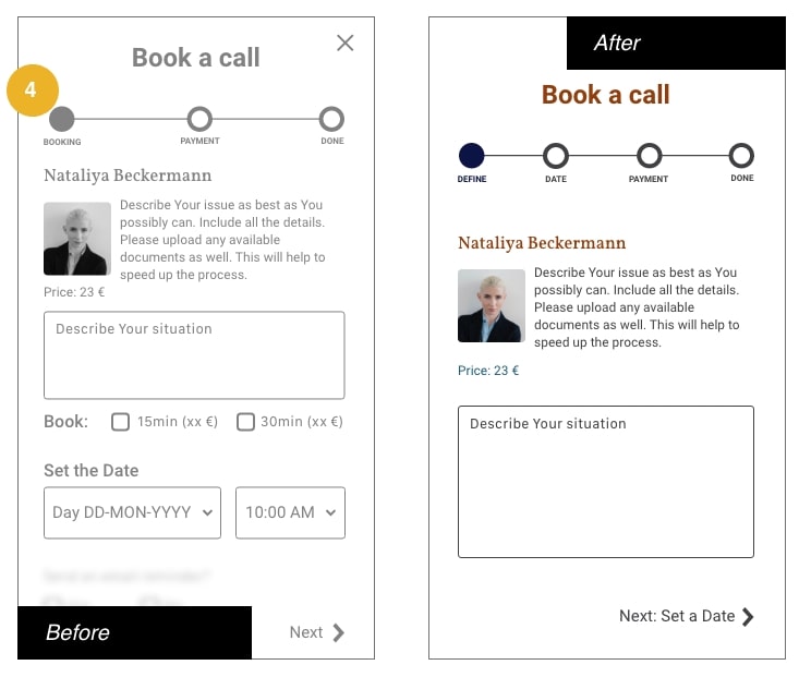
2. Time setting was made easier with the drop-down list that accommodates more time slots. The interface is now clearer.
3. Each next step (represented with the "next" arrow) was labeled so users can know at any moment what is the following step.
4. The booking process was separated into more steps. This is to declutter the interface and make the process easier and more transparent.
In the next step, I used Adobe XD to create a high-fidelity prototype. I reviewed it with my tutor, mentor, and my peers.
With their help, I made these improvements:
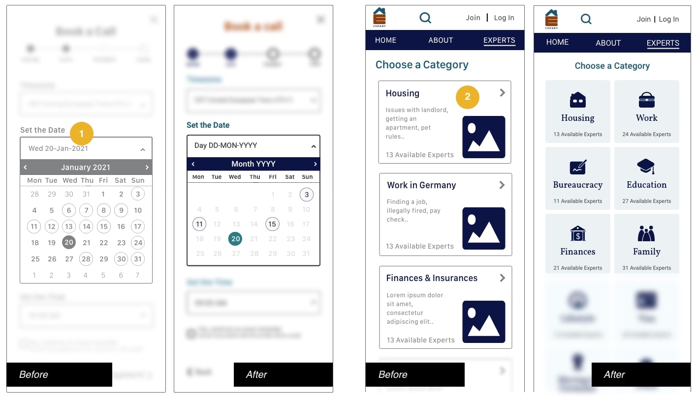
1. Unavailable dates were marked with a very light gray color, and available days stand out by being circled and filled with the color in addition to brighter color being added to the selected day.
2. The categories page was redesigned into boxes instead of a list, to reduce scrolling and make the web app easier to use.
QUALITATIVE RESEARCH
Following the task analysis tests, participants were asked a series of qualitative questions aimed at understanding their general perceptions and attitudes surrounding the website and Expany, the company itself.
- Participants were overall pleased with their experience and the process was as they expected compared to other login/signup and booking processes
- Participants found the tasks easy to complete
- Two out of six people were worried about a case if an expert cannot help them
- All of them found the idea of instant contact with the expert very useful and would use that service
NEXT STEPS
- Establish and test expert's interface
- Build and test in-call experience
- Develop and test chat option
- Create and test the call canceling function
- Develop documents uploading function
CONCLUSION
Overall, I think my designs were successful in creating a simple interface that allows users to easily search for and book a call with an English-speaking expert. Usability test results showed that participants reached a 100% completion rate for 3 out of 3 tasks. Participants felt the website booking process was familiar with those they already experienced. They felt it was easy and enjoyable.
Given the few usability issues identified in the prototype, however, I would like to validate the iterations I made by conducting another round of usability testing and make improvements toward a stronger solution.
